
Is Your Copy Hurting Your Conversion Rate? Let’s Fix It

Why might your copy be hurting your conversion rate? We’ve broken down some of the key reasons we’ve found through our own experiences, as well as straight from the users mouth in some user testing cases. We’ve also given you some actionable next steps you can take to improve your conversion rate through your copywriting.
Ever been on a website where you’re left wondering ‘what does this business even do?’. We’ve found this to be most common in SaaS or services based industries where the website is discussing a highly complex product or service and spends too long on the details rather than writing content in a way that’s easy to understand and quickly conveys why your product or service is better than your competitors. I assure you, if your product or service takes longer to decipher and doesn’t appear to be any better than a competitor, you will lose out.
I like to use the 10 second rule – this is often something we test when we conduct user testing for our clients as well. If your copy doesn’t convey the product/service and at least 1 value within 10 seconds of the page loading, rewrite your copy. We typically get users to view the page for 10 seconds then tell us what they believe the purpose of the landing page is and 3 key elements they noticed. If they can understand what the business does and notice at least 1 value proposition within their list of 3, then we know we’re on the right track.
We all know content is king but sometimes you really need to tone it down, especially when it comes to explaining products, services, or ideas in order to reach a conversion. If we had a dollar for every time the main complaint during user testing was ‘there’s too much content, I’m overwhelmed’ well… we would still be on holidays instead of writing this article!
Save your lengthy copy for your articles, FAQs, and resource centre when the user is in the best frame of mind for lengthy reading, and shorten your landing pages and keep them optimised for high conversions. This is especially true if your primary audience is viewing your website from a mobile device.
An English teacher of mine explained that content is like a chocolate block. A few rows of chocolate is lovely and enjoyable. But eating an entire block in one go is a huge turn-off.
Some ways you can make your block of chocolate easier to digest is by bolding particular information and using dot points, numbered lists, and content call-outs. This lets the user easily scan the content and pull out the information that they’re actually looking for.
This one may be a pet-peeve of mine so I’ll keep this point short and sweet, but there’s been a number of times I’ve clicked on an ad due to specific values or benefits of a product or service and then struggled to find that information on the landing page.
If you’re pushing a value, benefit, or offer in your ads please make sure it’s also the hero of the landing page. That’s usually the entire reason why somebody clicked on your ad in the first place. And please, if you’re selling a product and that product is a core feature in your ad, please link to the specific product instead of the category page or even worse, the home page. This miss-match of ad content vs actual landing page content is just a recipe for high bounce rates.
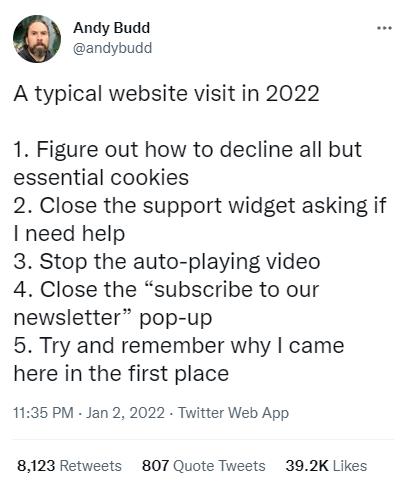
Stop it with the number of popups, support widgets, and amount of things that show up to the user before they’ve even had a chance to see the page. Yes, we’re considering ‘SIGN UP FOR 10% OFF’ as copy in this example as it’s content aligned with a conversion rate. We saw this Tweet that perfectly describes how we feel about these frustrating website elements.
We’re not the only ones who hate unexpected popups – Google has been considering them a negative SEO factor for years. What’s the best way to implement a popup you may wonder? Make it an expected action rather than an unexpected one. A popup is not an expected action of a page loading. But it is an expected action of clicking on a button, a notification, or a horizontal tab.
You want the user to convert right? Make that as easy as possible and ensure that your copy is always moving the user closer to that conversion. Make sure you always include a compelling Call To Action (CTA) to explicitly convey the next step and WHY the user should click through.
If you need help cutting out the clutter and getting straight to the point with your copy, we’re here all year! Get in touch with our team and we’ll put together a strategy that gets your copy on point for 2022.