How Our Website Was Born

Hi we’re iterate! We’re new here so we’re gonna take the spotlight for a second so we can introduce ourselves. *clears throat*
We’re a CRO, UX, and SEO specialist agency and we’re shaking up the Australian digital landscape, just like 007 would’ve wanted. These key services are rarely specialised in, so we’ve created a unique combination of the three to help you adapt to the changing needs of the digital landscape. We’re looking into the crystal ball and what we see is a world where all websites are a pleasure to use, conversion rates are high, and searchability is fantastic. That’s what we’re all about, improving user experience one iteration at a time.
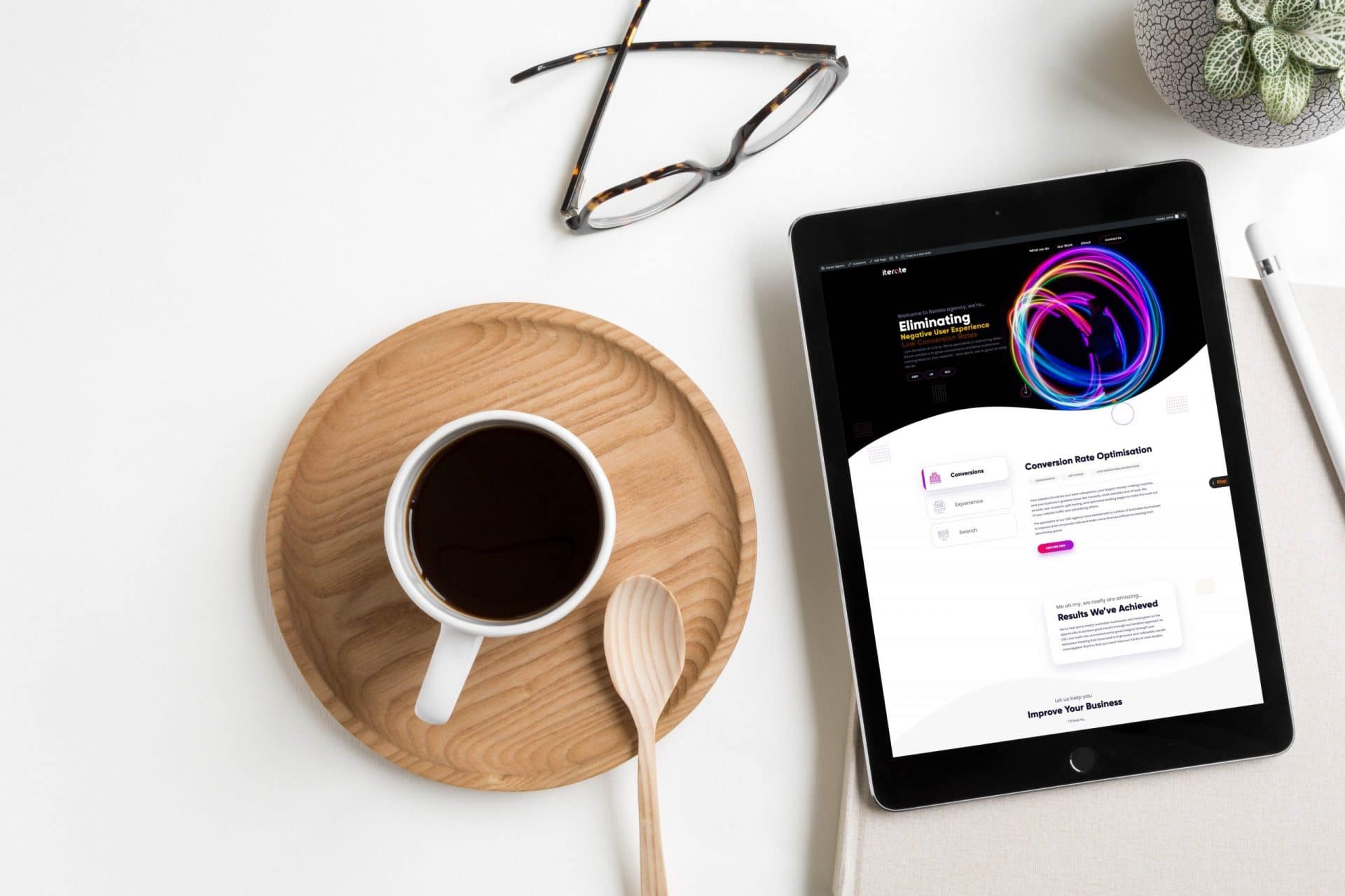
We know how to make a great first impression, so we enlisted our internal team to create a website that we were proud to stand behind. Our website is one of the first touchpoints for our clients, it’s a hub for information, and it’s our greatest sales person. We’re a smart and friendly bunch who needed a website that reflected us, so we truly embraced the mullet-approach; business in the front, party in the back. We wanted to take you for a brisk walk through our website to show you how we took a growth driven design approach, put UX and CRO first, and prepped our site for many iterations to come.
We did our homework. Not only did we research each individual service but we looked at the entire landscape. We researched and contrasted competitors and gathered data from our sister agency, Klyp, to help us understand the way an agency website works. We looked into the different tools we wanted to harness and created an implementation list. For the design component we searched for a range of inspiration from behance.net and decided which approach we wanted to take.
Next we jumped into strategy. Our Head of Strategy helped us knock out the nitty-gritty and ran many workshops to make sure we explored every option. We mapped out the website strategy, brand strategy, and marketing strategy so we knew strategically our strategy was the most strategic way to move forward with the strategic strategy… and we were prepared for any issue we might face. All team members were on board with the key pieces of information and knew what they had to do from there. TL;DR The Avengers assembled and promptly split up again to save the world, well, the parts they specialised in, anyway.
We already had a few ideas about how to create a great user experience and take a growth driven design approach on our website build. We wanted something simple but impactful, small but packed a punch, that flied like a butterfly but stung like a bee; the Muhammad Ali of websites. This website build was going to be short, sweet, and simple to develop. What we designed was something that laid the groundwork for constant improvement and iterations in the future. Iterate gotta Iterate. duh.
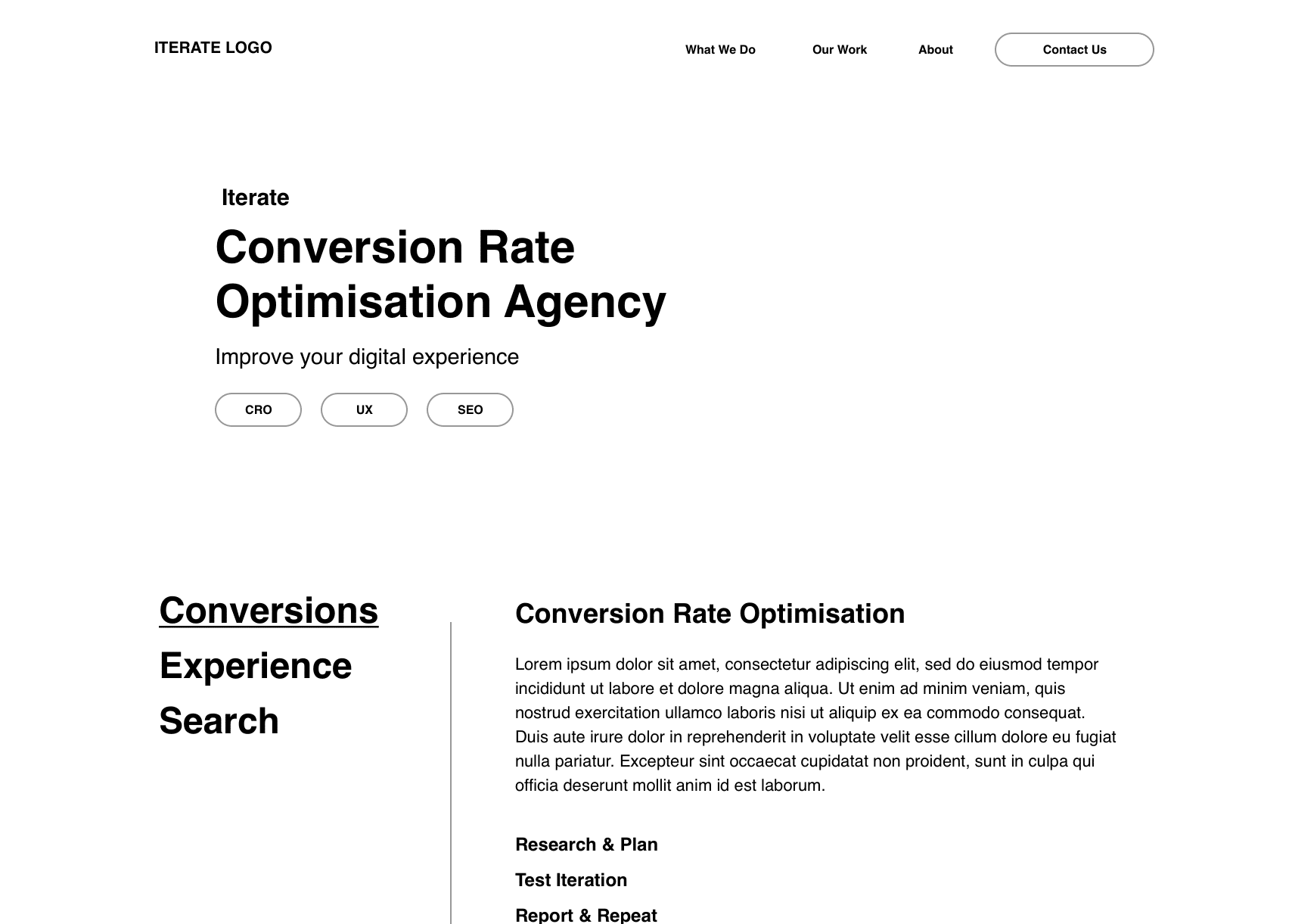
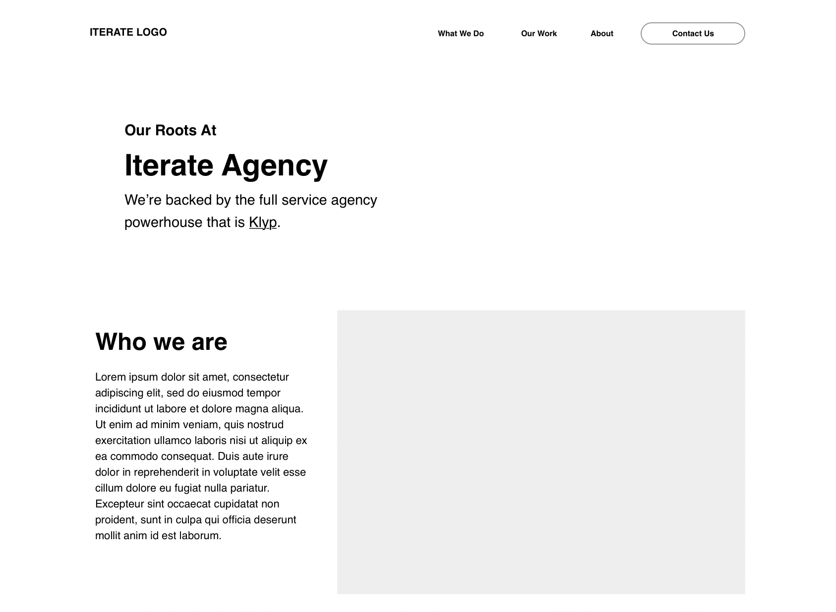
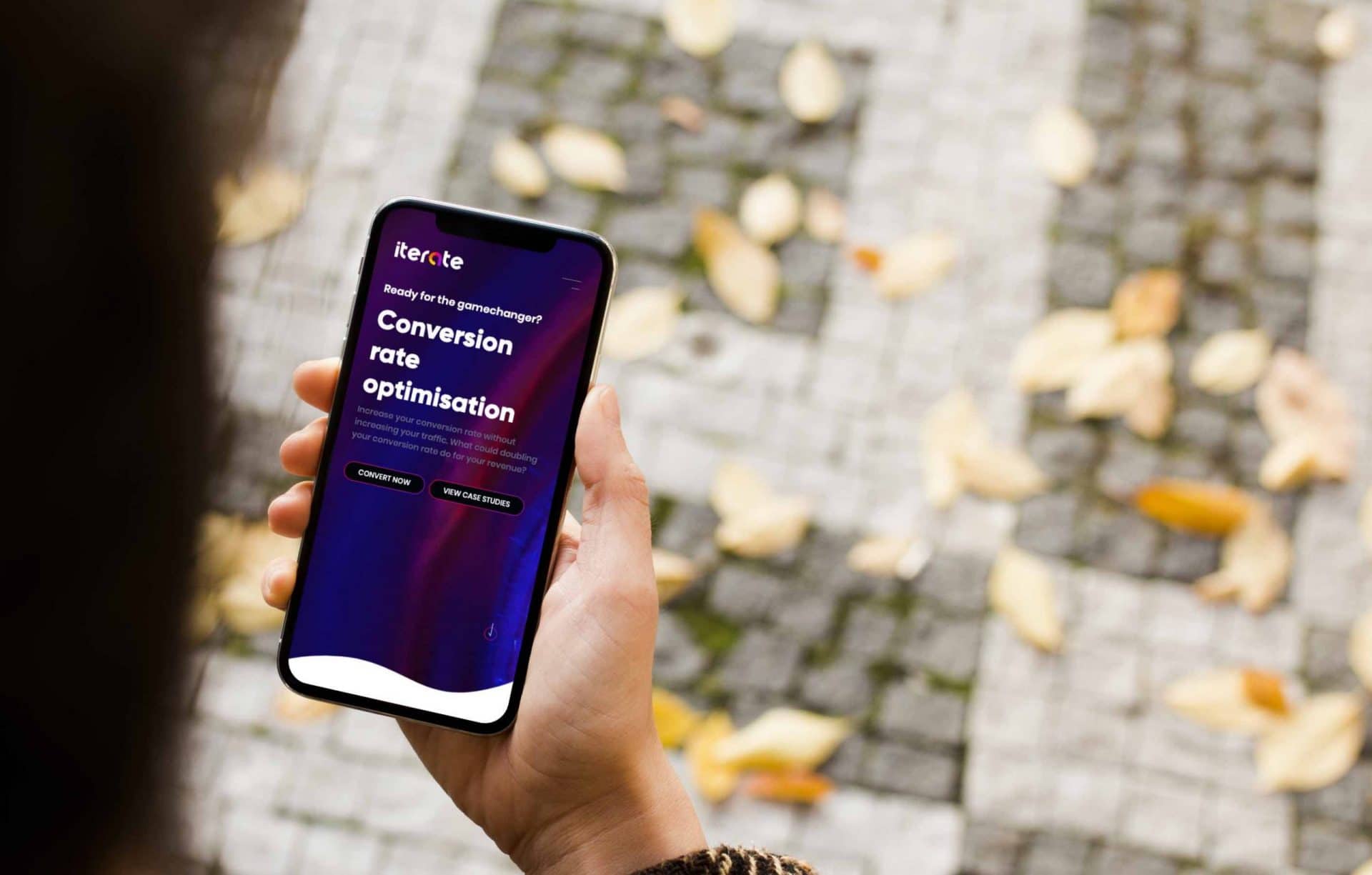
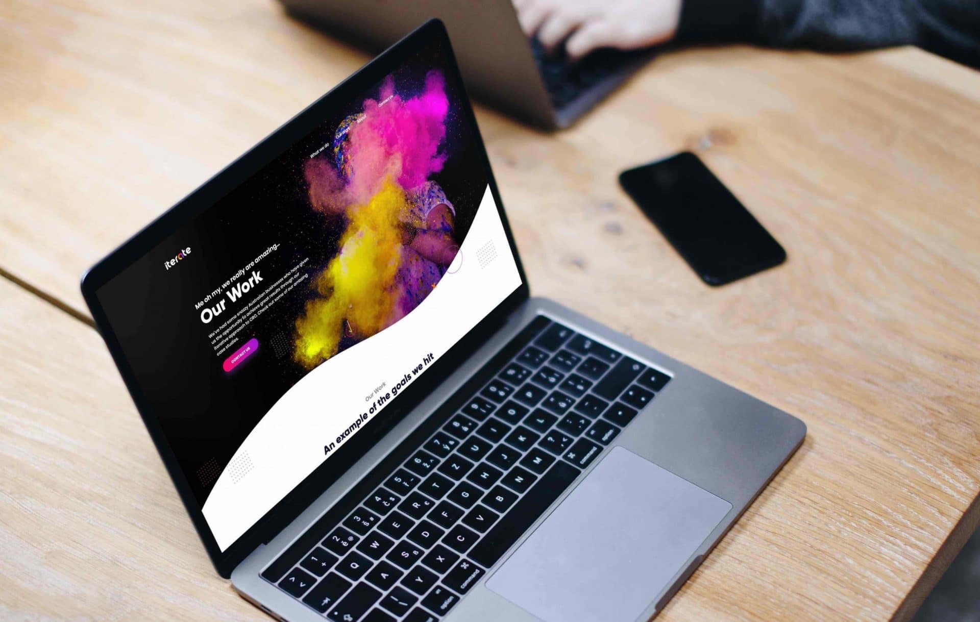
Our incredible designer then took our wireframes and Frankenstein’d them into existence, which had us screaming… IT’S ALIVE! We told him that we wanted to mix dark and light, masculine and feminine, and land on branding that just felt right for us. We asked him to create something bold, colourful, professional, that would stand out in a sea of same. We wanted to make an impact so we chose dark backgrounds with bright almost-neon colours and white backgrounds for all of the important information.
But don’t be thinking that our design work is done. In fact, you’re being tracked right now. Yes, you. As we speak, all your movements on this website are being tracked and analysed so that we can keep making future improvements to the website. We know that our website will look vastly different in 6 months time. Be the change you wish to see in the world… so we choose to be better.
Our website is fun and contains heaps of smaller micro interactions, which can only be used by people with tiny hands (just kidding, all hands are welcome). We’re very excited to watch our mouse hover heatmaps to see our users playing with certain elements. Micro interactions are what makes a website feel alive, so we wanted to balance fun and interaction with pure functionality to make sure that we aren’t stopping conversions, nor the good times.
Thanks to our strategy we settled on a brand voice which helped us spice up our copywriting and optimisation. Remember all that research we said we did? That also contained keywords so we knew how to split up our website and optimise each page. Our blog, the one you’re reading right now, should be full of useful industry knowledge that speaks directly to the user and breaks the fourth wall. We love transparency and want to build a blog that isn’t ‘just another industry wordpress blog’ because… boooooooring!.
…an iterate website that speaks to our brand, gets the point across, has great user experience, and is unapologetically honest. We can’t wait to see what our website looks like in 6-12 months because we’ve got plans coming out our ears. If you are a medical professional, please help. If you want to see how things change then join our newsletter so you can keep an eye out for our tests, iterations, and new functionality as we improve our website. Let’s be newsletter friends.