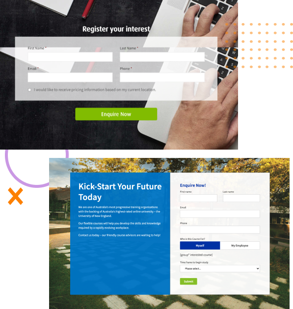
fbpx

Case Study for

Rent This Bike

We helped Rent This Bike obtain some fantastic results on a smaller budget by optimising their Shopify website for a higher conversion rate. Rather than customising their existing theme we re-themed their website and based our optimisation around the new design.

Before we get into the details...

Results, 1 Week After Launch


We were pretty stoked with the results of this simple theme re-fresh. We kept the cost to the client low, but managed to get results through the roof!

So far we’ve got a weeks worth of data and we’re quietly confident that this website will keep smashing goals. We’ll update the numbers as they change.

+166%

Transactions

+159%

Conversion Rate

+91%

Revenue

The cost of a low

Conversion Rate

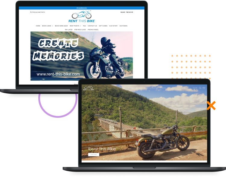
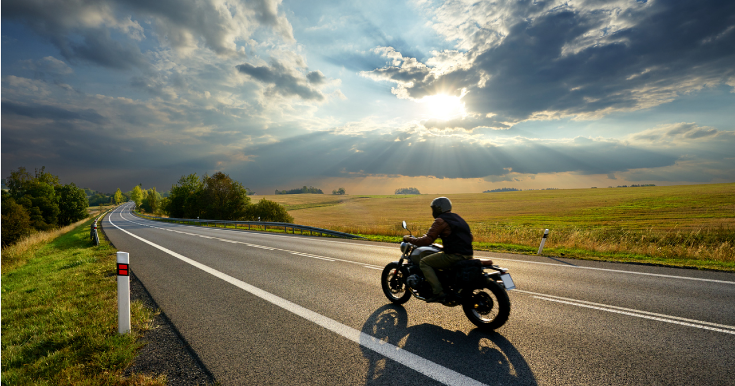
Rent This Bike was working with our sister agency, Agora, seeing some pretty great results, but they knew it could be better. The problem with a low conversion rate is that no matter how much you spend on your ads, you’ll always need to spend more to make more. That’s when we stepped in to lift that conversion rate and make the most of the money that Rent This Bike was spending on their ads.
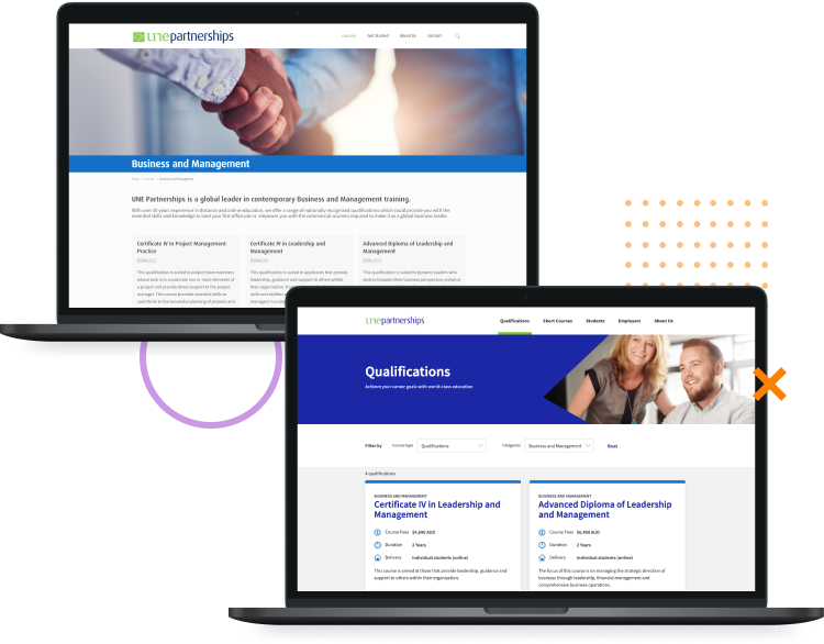
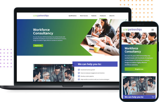
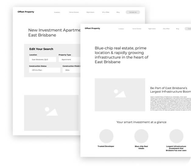
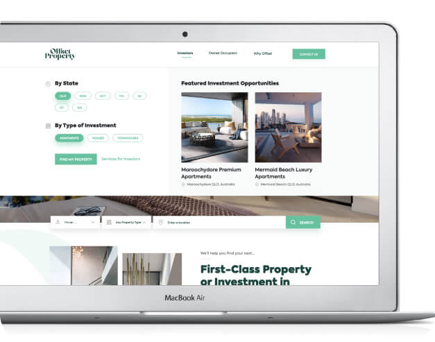
The Brief from RTB

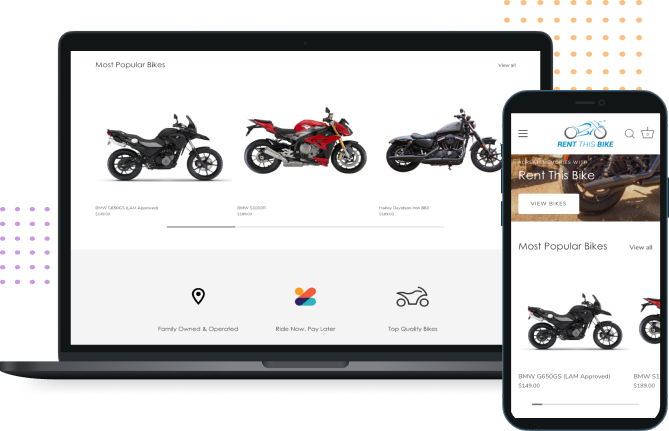
  • Enhance the overall design of the website
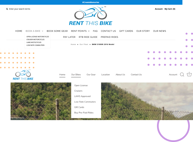
  • Improve the information architecture
  • Increase the conversion rate

Cleaning up the

Information Architecture & Menu

As you can see, their menu crossed two lines and separation and organisation of dropdowns was unclear. We re-categorised the site, merged a number of their menus and cleaned up the appearance.

Before & After

A shiny new design.

Desktop

USPs & Clear Direction for Users

We wanted to make Rent This Bike’s value very clear to users and also showcase their top bikes on offer. We re-worked the home page to create a clear separation of values vs products. Linked to their social accounts and also their core categories.

For a website re-theme on a budget, we’re pretty pleased with these results. Now Rent This Bike is ready for Black Friday and their upcoming ad campaigns with no worries about their conversion rate wasting ad spend!

Does your website need a re-design?

Improve Your Website

I’d love to…

    Woo hoo!

    You have successfully sent your message.

    We'll revert back to you as soon as possible.
    Back to Home

    Case Study for

    UNE Partnerships

    We’re helping UNE Partnerships offer world class online education that can help you to secure your first office job or empower you with the commercial acumen required to establish your credibility as a global business leader.

    Before we get into the details...

    Results, 1 Month After Launch


    We absolutely loved working on this project, and the results just make it that much sweeter! We increased UNE Partnerships conversion rate from 5.54% to 7.24% for their most important KPIs.

    Want to know how we did it? Read on…

    +28%

    organic traffic

    +31%

    conversion rate

    +78%

    goal completions

    Where our partnership

    Started

    UNE Partnerships approached us mid-way through last year (2020) during a year which will certainly remain on everybody’s minds for a while. The shift that the world took to online and virtual training meant UNE Partnerships was poised to become leaders in online education.

    Our Brief from UNE Partnerships

    • Focus on building B2B side of the business by designing new categories and service pages for employers
    • Re-design information architecture to improve user experience and course navigation and findability
    • Overall updates to website plugins and security
    • Increase form submissions and enrolments by streamlining the process

    Opportunities We Discovered

    • Harness growth in the B2B side of the business
    • Creating a greater user experience through website updates would improve the overall conversion rate
    • Plenty of room to move when redesigning pages for UX which creates opportunity for conversion rate and search engine optimisation
    • Opportunity to decrease the number of clicks to conversion through IA, contact form, and enrolment optimisation

    During our analysis, we found that UNE Partnerships had a convoluted and lengthy navigation process, high number of clicks to conversion, a low focus on the B2B side of the business on the website, and lacked website maintenance during the past few years. We knew we could create a higher rate of enrolments and contact form submissions by improving the flow of the website. And so we quickly got to work.

    The Process

    Information Architecture & Mega Menu

    We started with a top down approach, beginning with site structure and presentation of information. We wanted to make sure we removed unnecessary clicks and made finding Qualifications, Short Courses, and Employer Services easier. We recognised a number of areas where an additional click was required and filtering wasn’t enabled. This led us to choosing to implement a mega menu, followed by a category and filtering system. Students could simply navigate via the mega menu, or select an overall course category and filter from there to find what they need. The menu was the first iteration of our project, pushed live back in November while we worked on the rest in the background.

    Qualifications & Short Courses Redesign

    We wanted to make viewing UNE Partnerships’ list of courses easier by putting the primary information on the course cards and colour-coding to match the category. We started by reviewing the course list presentation by adding a course type and category filter.

    On the course page, we included a number of items above the fold; fees, duration, and delivery while making it easier to view the course code and a short summary of what to expect. We adjusted this format to suit both Qualifications and Short Courses. Then we implemented points of difference, further course details and limited scrolling by designing accordions with further information on modules, units and other course information.

    Course Layouts

    Qualifications Layout for the Cert 3 in Business Administration.

    Desktop

    B2B Services Implementation

    UNE Partnerships wanted to expand into the employer market through business training within Workforce Consultancy, Learning & Co-Design, Training Solutions, and Tailored Qualifications. To help them enter this market through their website, we created a template for their employer services pages, which quickly explained what the service aims to achieve, a breakdown of inclusions and a compelling call to action, prompting users to get in touch.

    Finish it all off with

    Contact Form Optimisation

    We wanted to gather a bit more qualifying data for UNE Partnerships’ enquiries. We wanted to know the reason behind their form submission and some course specific requirements, which meant that the team over at UNE Partnerships could qualify them. We linked all of their information through Hubspot via our partners at Agora Agency and customised the contact form depending on qualification, short course, or employer services.

    Does your website need a re-design?

    Improve Your Website

    I’d love to…

      Woo hoo!

      You have successfully sent your message.

      We'll revert back to you as soon as possible.
      Back to Home

      Case Study for

      Offset Property

      Leading the Australian Investment Market with Offset Property.

      Leading the

      Australian Investment Market

      Offset Property is a real estate listing site with a twist. Beyond offering exciting investment opportunities, they also offer complimentary services to assist with financial & investment advice which really sets them apart from competitors like realestate.com and Domain. Though the good times don’t stop there, Offset Property partners with luxury Australian property developers that they have pre-qualified as a-grade investments, ensuring top notch quality, location, and blue-chip real estate.

      The Offset Property Brief

      1. Design a website that conveys luxury to investors and sells the dream to homeowners
      2. Develop a real estate search functionality so that users can easily find their property
      3. Create an easy to use mega menu
      4. Highlight the services that Offset Property provides to investors and owner occupiers
      5. Track user movement on the site and constantly improve on the design

      Offset isn’t your average Joe, it’s the kind of Joe that knows what’s up in Real Estate and can score you a great investment that’ll grow in value. Better yet, this Joe has his finger on the pulse, and exclusive access to opportunities you won’t find elsewhere. We needed to make these things abundantly clear from the moment the page loads. “But Iterate, how did you do this?” You might be thinking. Well young whippersnapper, keep reading.

      The Process

      Discovery & Research

      We started off with the research component, our bread and butter, and began to map out how our ideal users would interact with this website. We settled on our two key target markets:

      1. Property Investors
      2. Owner Occupiers

      We decided that for SEO and usability, it was best to split the target groups so that the user never has to guess whether this website was made for them. This especially mattered because there are specific services for each group, which had potential to become confusing for the user & messy for Offset Property, if not handled correctly.

      UX Wireframes & Mapping the Site Functionality

      We had a lightbulb moment and came up with a few core functionalities that the website needed, and they were as follows;

      1. Interactive mega menu to quickly filter search results
      2. A search functionality on each core page to direct the user exactly where they want to go
      3. An advanced search for…
        a. Type of home
        b. Location search
        c. Number of rooms
        d. Number of bathrooms
        e. Construction status
        f. Construction finish data
        g. Price range
        *takes a deep, suffocated breath in*
      4. Map integration
      5. Featured listings
      6. Marketing qualified contact forms which split up the name of the development as well as their property partners to keep track of leads *exhales*

      UI Designs & Solidifying

      The Usability

      Finally we could put everything together and start to see what this website would look like in action, and boy is it a beauty. We started with the UI designs and ensured the website was achieving peak usability. We ended up changing a few things around in this phase because, in hindsight, they looked better in wireframing than in the final design. And that’s a good Oprah moment there folks, always refer to your goal & be willing to change if it isn’t serving said goal. We also took the opportunity to improve and add some additional features because, why not? Sprinkle a little something-something extra, and make the whole thing a little more delightful.

      Content Optimisation

      Last but not least, SEO. We optimised the heck out of the content across all core pages of the site to make sure we were gathering service related search terms and sending people to the right page. The content optimisation doesn’t stop-timisation there though, we’re also currently working on a blog to help boost optimisation and improve the value we can offer to users. Offset Property is at the forefront of the real estate and the property market and their insider knowledge is manila folder worthy, and NEEDS to be shared. . We don’t like adding blogs for the sake of blogs, but when our client can add this much value, we just have to. With Offset Property changing the game in the real estate space, and Iterate leading the pack with CRO, we became the dynamic duo that Offset not only needed, but wanted. We’ve laid the groundwork for a grey goose vodka-level, smooth experience, and will continue to optimise this website to grow website visitors, and raise those profits.

      If you want to work with our stellar team to make some magic, like Offset did, then enquire below and we will be in touch.

      Let us help you

      Improve Your Business

      I’d love to…

        Woo hoo!

        You have successfully sent your message.

        We'll revert back to you as soon as possible.
        Back to Home

        We're still working on these results...

        Modinex (Coming Soon)

        Stay tuned for the launch of this website, but in the meantime have a read of our Personlyzd case study to get a feel for what we do for our clients.

        Let us help you

        Improve Your Business

        I’d love to…

          Woo hoo!

          You have successfully sent your message.

          We'll revert back to you as soon as possible.
          Back to Home

          We're still cooking up these result cookies...

          Edge Agency (Coming Soon)

          In the meantime, check out our case study for Personlyzd so you know what to expect when we’re finished with Edge Agency.

          Let us help you

          Improve Your Business

          I’d love to…

            Woo hoo!

            You have successfully sent your message.

            We'll revert back to you as soon as possible.
            Back to Home

            Our Results Working With

            Personlyzd

            A personalised UX, CRO, & SEO approach for a personalised financial brand

            The Brief

            Personal Experience

            Creating a Personal Experience and High Conversion Rate for a New Brand Launch (spoiler alert: we did good.) Our client brought a fan-freakin’-tastic idea to the table, a financial comparison website with a personalised touch. We put our heads together, mashed up our knowledge and turned their dream into a reality. Iterate worked closely with Klyp’s truly impressive Creative & Development teams to create a
            website that is not just handsome, but delivers on UX & CRO.

            Here’s what one of our favourite clients wanted us to do:

            1. Map out the entire user journey and information architecture across the website
            2. Develop UX wireframes based on user research CRO principles – no assumptions (Ass, You, Me, you know the saying.)
            3. Create a no BS, clean and simple interface across a number of different services and tools
            4. Integrate the on-page messaging with the Klyp Marketing team to improve the conversion rate from the initial touch point & deliver results like it’s our due date
            5. Discover more about their audience and key demographics
            6. Optimise their website for SEO to go up against larger competitors who have been in the market for years to show them there’s a new sheriff in town

            Pain Points

            The Beginning of Op-time-isation

            Personlyzd had some pretty genius ideas floating around in their mind palace, but the
            cookies were a little undercooked. The only solution rested in the soft, welcoming embrace only iterate could provide. We pulled together as a team and formulated the process, users, target market and helped build it from the ground up, helping this caterpillar go full butterfly. After many brainstorm sessions and workshops, we did it, we effectively mapped out the entire process from start to finish for each individual service. We also mapped out how each service integrated with each other (but we don’t mean to brag).

            We’re talking the basics, we practically drew up these plans in cave drawings. Loin cloth attire was encouraged at all meetings. It didn’t really catch on though. Weird. Anyway, here’s some of the questions we asked:

            1. Who is the customer?
            2. What do they care about/value?
            3. How does Personlyzd add value for the customer?
            4. What are your USPs?
            5. What are the key areas of functionality that we need on the website?
            6. What happens after you collect a lead?

            Goals

            Very Stretch-y Goals to Hit

            Our clients love to set stretch goals for us, and that’s okay, we eat stretch goal salad for lunch. And listen, we’re not going to lie, we blew this one out of the park, like full home run out of the park… but you’ll have to keep reading to find out how.

            Personlyzd gave us a few pretty giant goals to achieve, and honestly, we thought they were a little crazy considering they were a new brand entering the market, with a new website. But if there is one thing we do at Iterate, it is shy away from a challenge. Kidding, of course. We smashed those goals too.

            Here’s the spicy goals Personlyzd set:

            1. 5-10% conversion rate
            2. Drive online conversions, aiming for 6-8 leads per day
            3. Fantastic user experience (not 100% quantifiable but we know)
            4. Quality leads that their sales team could easily convert
            5. Flawless functionality for custom built tools, meaning no errors and minimal negative user interactions
            6. Get the most information from users in the least amount of clicks

            Now it's time for

            The Process

            • Discovery and Research

              Little bit of

              Discovery and Research

              Planning out the website functionality was our first task. After many a workshop we pinned down the process and user journey from start to finish, across every service offering and tool on the website. A true mic-drop moment. But…

              We needed answers. We had the questions but the answers to the questions were yet to be had. So we enlisted a bunch of anonymous survey-doers for user-research to provide the answers to said questions.

              We used this information to develop some background information around our customers, who they are and what they want. We learnt about their values, when they would research certain financial services, and which ones they’d likely convert on. It’s safe to say we got our answers, and more questions. But answers mostly.

              Every action going forward was based on baby’s first words, data.

            • UX Design & FUNctionality

              Then it's time for

              UX Design & FUNctionality

              After discovery came the fun part! Just kidding, we think all parts of this are fun, because boring things suck & we love our job. We used the process map to start developing our sitemap and information architecture. After we had a great base to work with, and we’re talking big, nice frosted bottom-tier wedding cake kind of base, then we went to work on the UX Design and Functionality.

              We created wireframes for all key pages and for every step that the user would take throughout their journey. We took special note of key conversion pathways and made sure we presented the right information at the right time to make the path the conversion smooooooth. We made sure all values and USP’s were present at key points and that important information was easy to locate and understand. We ain’t playing no game of Where’s Wally here, ladies and gents. The red, stripy shirt man is in clear view and here to help.

            • Optimisation, Tracking, & Analysis

              Finish it off with

              Optimisation, Tracking, & Analysis

              With UX design done and dusted, it was time to tackle search engine optimisation across the entire website. We polished up this website until it was sparklin’ and made sure that all messaging matched the campaigns that the Klyp Marketing team had brewing.

              Once the website launched we started tracking. Not the ear to the earth, tasting the dirt kind; We save that for team bonding exercises. We mean website tracking to capture every interaction that we valued. We made sure to set up a clear distinction between goals and events so that our goals were only tracking the final conversion while our events were tracking each step that the user was taking. That way we knew that our end conversion rate was based on actual leads, rather than interactions like PDF downloads, steps in the funnel, and other interactions. We aren’t fakers like those PDF download tracking companies. We’re the real deal and we care about goals that are actually making our clients money! Sorry, we’re a bit passionate about data tracking…


            “We love the team at iterate! The iterate agency worked on the UX, CRO, and SEO component of our Personlyzd website. They were efficient and professional. Will definitely be working with them in the future, Thanks so much ITERATE! 5 Stars!”

            – Aleesha Edmonds, Chief Operations Officer at Personlyzd

            Our Results with Personlyzd

            Smashing Goals

            The Personlyzd website ended up converting so highly that they asked Marketing to drop the budget. Now that’s what we call Nigel Thornberry levels of smashing goals!

            Here’s what we achieved in the first month:

            24 %

            overall conversion rate

            25 %

            conversion rate for paid ads

            764

            goal completions (27 per day)

            The Final Results

            A Personalised website backed by UX and CRO principles

            We’re naturally stoked with the results from Personlyzd and it keeps improving each week as we make new iterations! We can’t wait to see how this website looks in 6 months time, not to mention it’s turned into a data gold-mine thanks to the amount of traffic it is already receiving. Cue the image montage below (everyone loves a good montage) :

            Let us help you

            Improve Your Business

            I’d love to…

              Woo hoo!

              You have successfully sent your message.

              We'll revert back to you as soon as possible.
              Back to Home