Iterations Vo.1 | March 2021
Kimberley Maunder
Mar 10 .
Each month we take a long hard look at our website and try and see it through fresh eyes. We try to be as ruthless as possible and think ‘if I didn’t know what iterate was, would I have a pretty good idea after 30 seconds of being on this website?’. We review each part of the content and make sure that it’s providing value to the user, and check if there’s anything missing. In this first iteration we had a lot missing but after gathering user data and feedback from clients we had some great ideas for what we were going to do next.
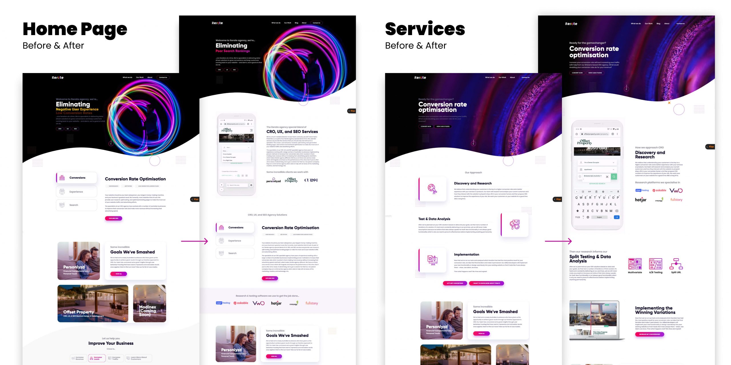
To add some context, this is what our pages looked like before and after our incredible developers brought our ideas to life.

We pushed the changes to all of our ‘services’ pages plus our home page but, to save you from reading a boooooring essay, I’ve just included a couple of examples. Now this was a pretty drastic change because we wanted our first iteration to pack a punch. We didn’t just make visual changes, we also improved the website performance so that our site loaded faster.
The results we saw from this change;
Don’t worry. We’ll have someone assist in picking your tongue up off the floor. But let’s dive into why we made these changes and the data behind it.
We noticed that users weren’t very engaged with the content after their second scroll across most pages. We deduced that this was due to the repetitive nature of the old content. It was a bit lacklustre so we spiced things up with a gif, images, before-and-afters, and examples of work to keep things interesting.
We chatted to clients who enquired through the website and found holes in what they knew about Iterate and the services we provide. That simply would not do, so we made an effort to educate as soon as possible so they become a more informed lead once they reach our alarmingly excellent team!
This one is just us being picky. We (the collective ‘we’ – that means you too) get bored easily these days thanks to shrinking attention spans and all that juicy on-demand Netflix content. We’ve become accustomed to a very engaging user experience when it comes to websites, so we simply made it more interesting. Now when you find yourself scrolling through the iterate site on a cold winter’s morning, or during the ad breaks, you’ll be delighted by various micro-interactions and animations.
This one came from our clients asking what tools and programs our specialists are all-about. We use a plethora (yeah, we said plethora) of tools but not a single one was mentioned on the site. That’s fixed now for your viewing pleasure.
We noticed a higher than usual bounce rate, (honestly we’re still working on it) which we believe is due to the user not being engaged within those first few seconds on the website. In our grand attempt to fix this, we improved the page speed and presented the users with the most valuable pieces of information, including that spicy aforementioned gif to keep their eyes interested.
Our bounce rate mostly remained the same, which has us scratching our heads, but that’s okay, not all changes on a website will have a purely positive effect. Sometimes they won’t do much at all for certain metrics. So just like any great CRO team, it’s back to the drawing board for this one.
That’s it for this month folks, we’ve got some more changes in the works at the moment so look out for our next iterations article.