fbpx

Case Study for

UNE Partnerships

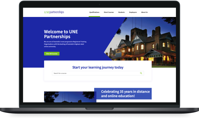
We’re helping UNE Partnerships offer world class online education that can help you to secure your first office job or empower you with the commercial acumen required to establish your credibility as a global business leader.

Before we get into the details...

Results, 1 Month After Launch


We absolutely loved working on this project, and the results just make it that much sweeter! We increased UNE Partnerships conversion rate from 5.54% to 7.24% for their most important KPIs.

Want to know how we did it? Read on…

+28%

organic traffic

+31%

conversion rate

+78%

goal completions

Where our partnership

Started

UNE Partnerships approached us mid-way through last year (2020) during a year which will certainly remain on everybody’s minds for a while. The shift that the world took to online and virtual training meant UNE Partnerships was poised to become leaders in online education.

Our Brief from UNE Partnerships

  • Focus on building B2B side of the business by designing new categories and service pages for employers
  • Re-design information architecture to improve user experience and course navigation and findability
  • Overall updates to website plugins and security
  • Increase form submissions and enrolments by streamlining the process

Opportunities We Discovered

  • Harness growth in the B2B side of the business
  • Creating a greater user experience through website updates would improve the overall conversion rate
  • Plenty of room to move when redesigning pages for UX which creates opportunity for conversion rate and search engine optimisation
  • Opportunity to decrease the number of clicks to conversion through IA, contact form, and enrolment optimisation

During our analysis, we found that UNE Partnerships had a convoluted and lengthy navigation process, high number of clicks to conversion, a low focus on the B2B side of the business on the website, and lacked website maintenance during the past few years. We knew we could create a higher rate of enrolments and contact form submissions by improving the flow of the website. And so we quickly got to work.

The Process

Information Architecture & Mega Menu

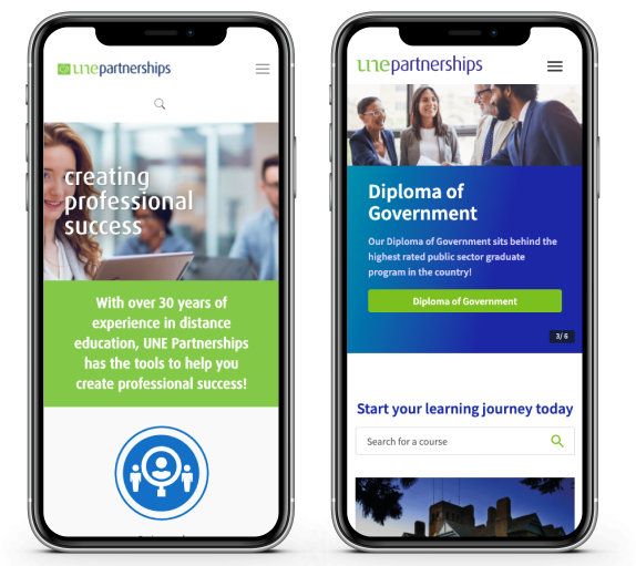
We started with a top down approach, beginning with site structure and presentation of information. We wanted to make sure we removed unnecessary clicks and made finding Qualifications, Short Courses, and Employer Services easier. We recognised a number of areas where an additional click was required and filtering wasn’t enabled. This led us to choosing to implement a mega menu, followed by a category and filtering system. Students could simply navigate via the mega menu, or select an overall course category and filter from there to find what they need. The menu was the first iteration of our project, pushed live back in November while we worked on the rest in the background.

Qualifications & Short Courses Redesign

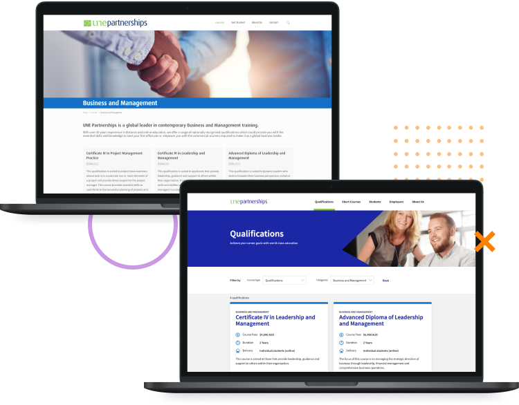
We wanted to make viewing UNE Partnerships’ list of courses easier by putting the primary information on the course cards and colour-coding to match the category. We started by reviewing the course list presentation by adding a course type and category filter.

On the course page, we included a number of items above the fold; fees, duration, and delivery while making it easier to view the course code and a short summary of what to expect. We adjusted this format to suit both Qualifications and Short Courses. Then we implemented points of difference, further course details and limited scrolling by designing accordions with further information on modules, units and other course information.

Course Layouts

Qualifications Layout for the Cert 3 in Business Administration.

Desktop

B2B Services Implementation

UNE Partnerships wanted to expand into the employer market through business training within Workforce Consultancy, Learning & Co-Design, Training Solutions, and Tailored Qualifications. To help them enter this market through their website, we created a template for their employer services pages, which quickly explained what the service aims to achieve, a breakdown of inclusions and a compelling call to action, prompting users to get in touch.

Finish it all off with

Contact Form Optimisation

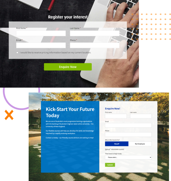
We wanted to gather a bit more qualifying data for UNE Partnerships’ enquiries. We wanted to know the reason behind their form submission and some course specific requirements, which meant that the team over at UNE Partnerships could qualify them. We linked all of their information through Hubspot via our partners at Agora Agency and customised the contact form depending on qualification, short course, or employer services.

Does your website need a re-design?

Improve Your Website

I’d love to…

    Woo hoo!

    You have successfully sent your message.

    We'll revert back to you as soon as possible.
    Back to Home